
TJC Rebrand
The Jockey Club was started in 1894 to allot dates for race meetings, license jockeys and trainers, appoint officials, maintain an official studbook and revise the Rules of Racing. Over the course of the ensuing 122 years The Jockey Club has not only worked to maintain the integrity of the sport and the breed of American thoroughbred but has also taken a leadership role in critical areas that benefit the industry including safety, medication, marketing, equine welfare and countless others. Rebranding this 122-year-old company that is the single most important entity in american horse racing was a huge honor as well as a huge undertaking.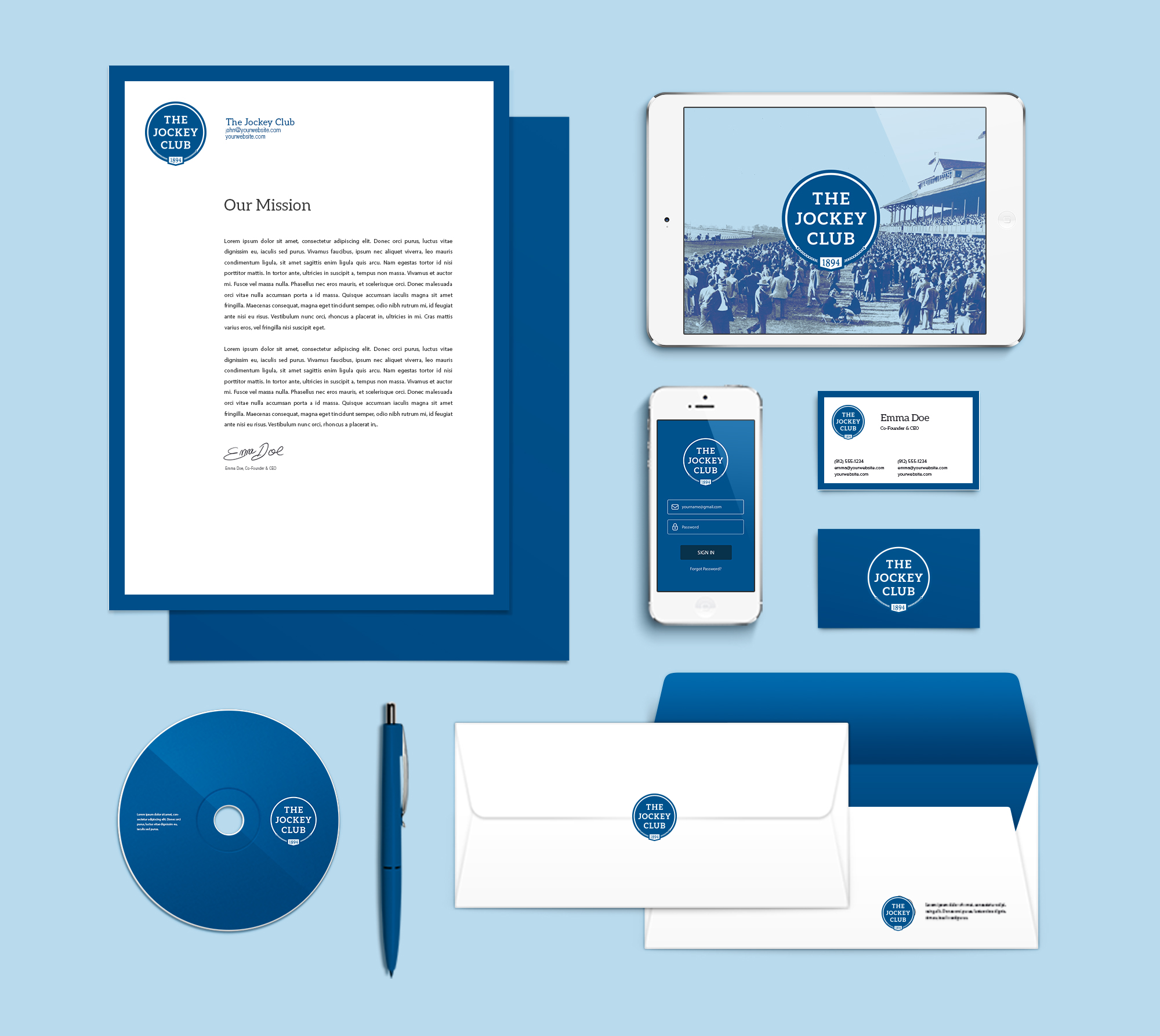
Identity System
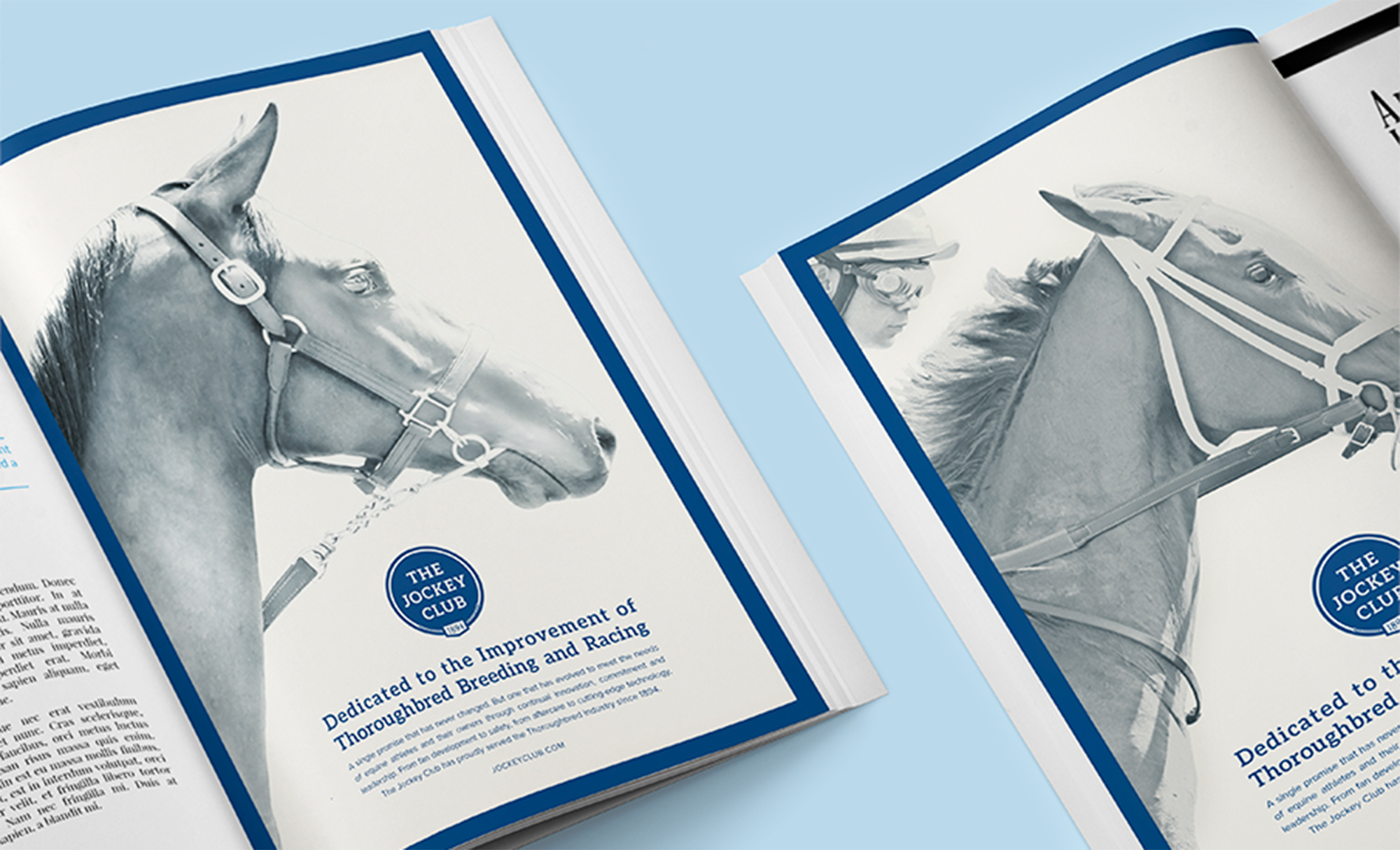
Not only were we tasked with rebranding The Jockey Club but also building a visual identity system that lends consistency and structure to The Jockey Club family of brands. The Jockey Club had grown to represent more than 20 brands with logos of varying colors, typefaces, shapes and symbols.

Process
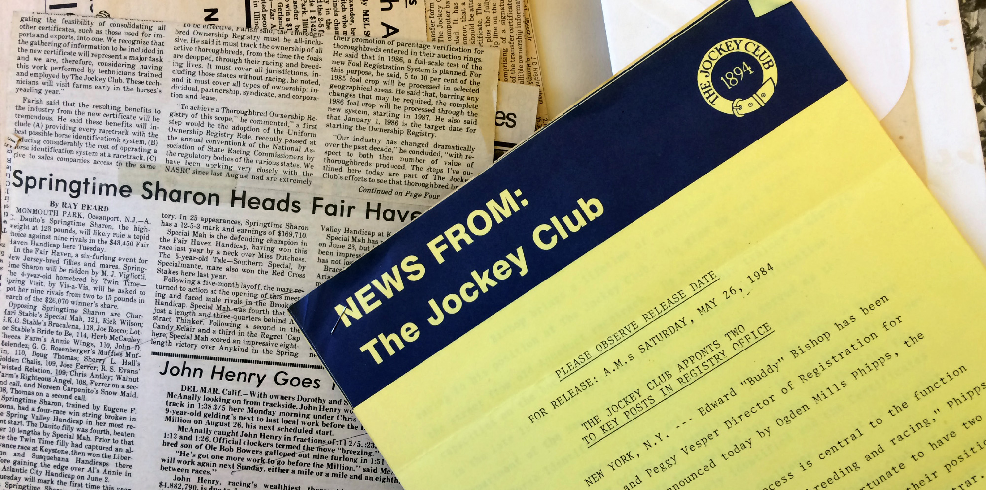
When taking on the challenge of rebranding a 122-year-old company, we first needed to fully understand the brand, its reason for being, its heritage and its evolution. This process involved three major forms of research that helped us put The Jockey Club brand into focus: Historical Context, Archival Research and Stakeholder Interviews.
Deconstructing a Brand
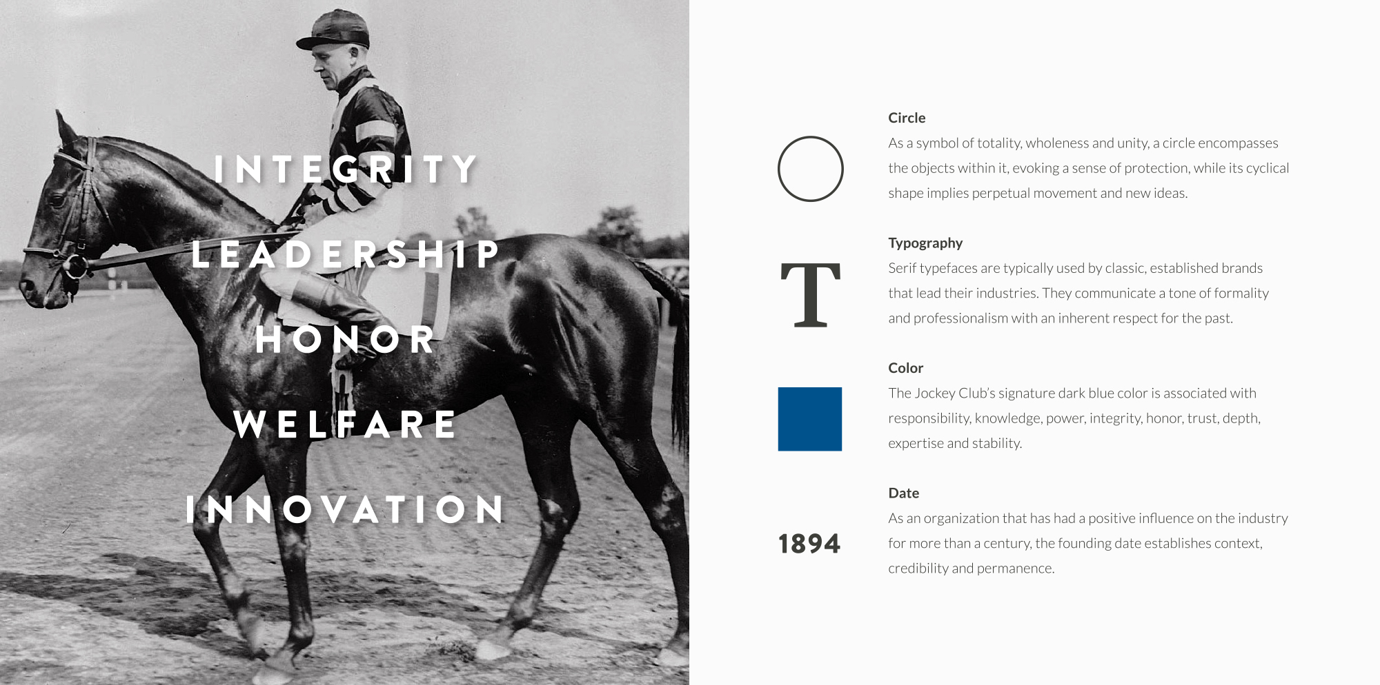
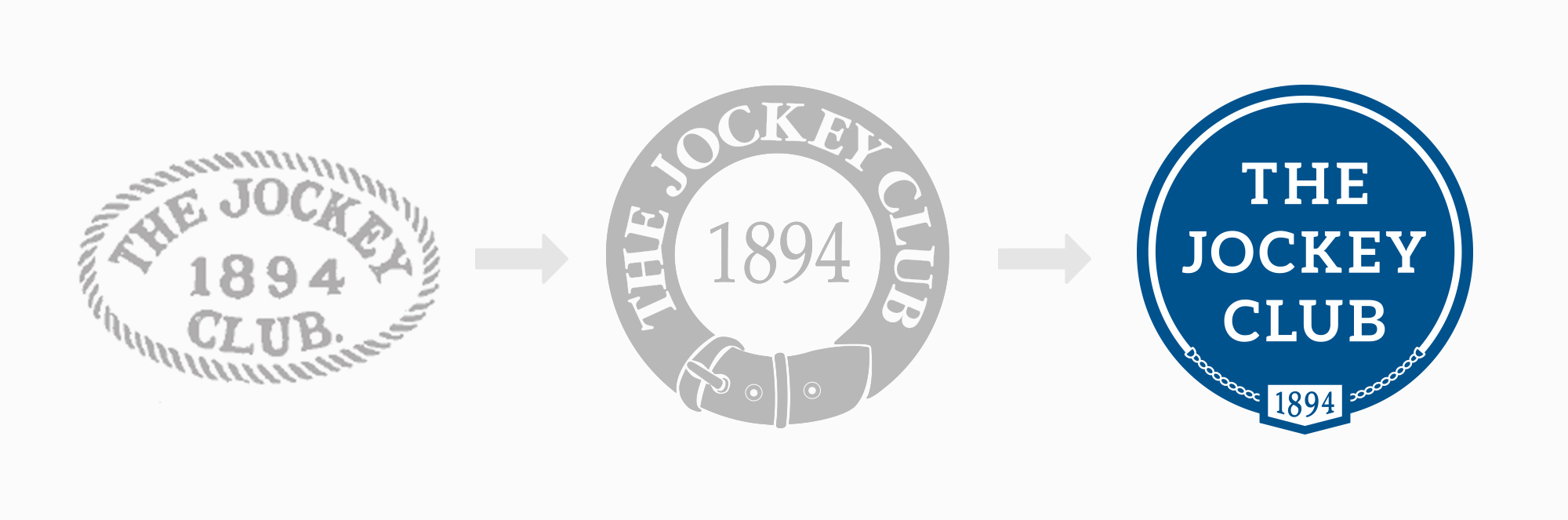
A 122-year-old company with a logo that has gone unchanged for over 30 years has a lot of brand equity. We were able to hone in on key characteristics that the brand embodies and hopes to communicate. We also identified visual elements that have been consistent throughout the brands history and most importantly resonate with the key characteristics of the brand.
Explorations
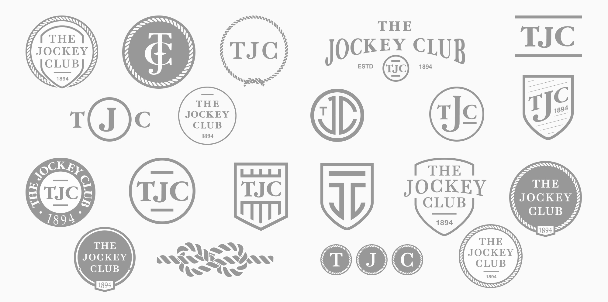
After researching is was time to start exploring ideas for a new logo. Should it just be an update of the old logo? An evolution? An homage to the original logo? An acronym? Or something completely new and different? Below are just a few of the many quick explorations.
Branding with Purpose
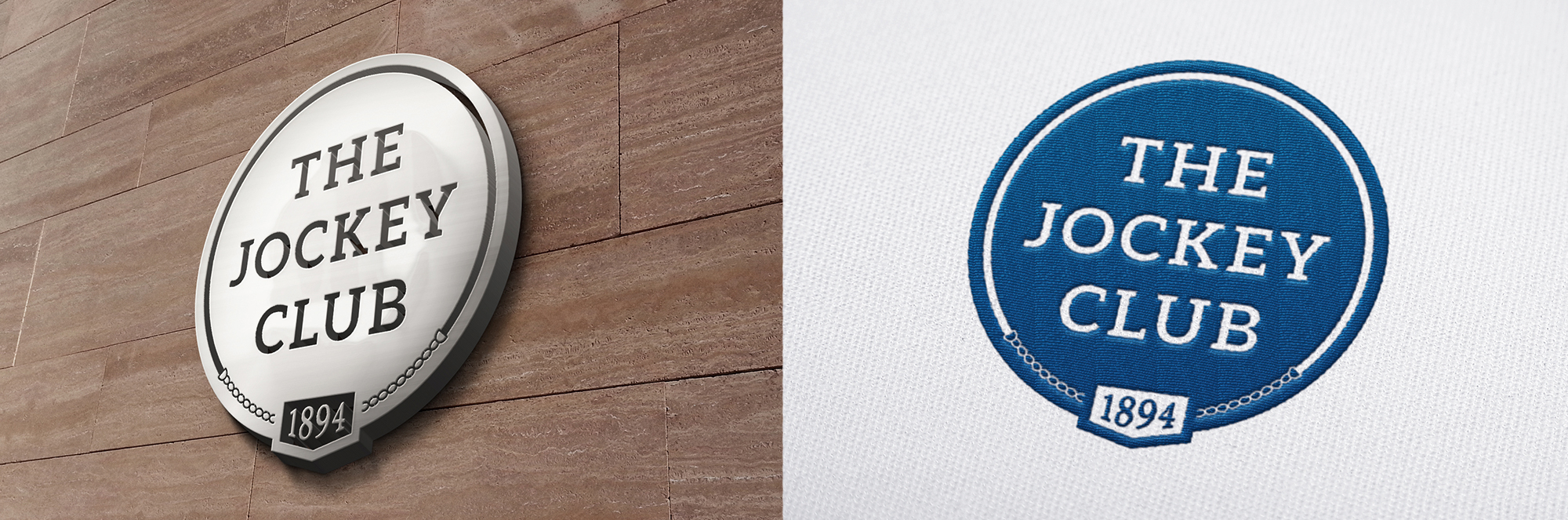
By building on established visual elements, the proposed logo is a natural evolution for The Jockey Club brand. Overall, the design is contemporary, yet traditional. It combines elements from the past in a way that feels new, yet timeless. In essence, this design pays homage to The Jockey Club’s heritage, protecting the integrity of the brand, while speaking to its progressive, forward-thinking nature.
Cornett Advertising
Chief Creative Officer: David Coomer
Designer: Matt Newton
Copywriter: Jonathon Spalding